
Project Overview
For this 24-hour hackathon, presented by Google, my team and I were tasked with creating a digital solution that would improve our communities’ access to healthcare. More specifically, we were instructed to focus our efforts on accessibility. Among 6 teams of 55 students, ranging from UX designers to web developers and data scientists, my team was selected as the winner of this industry challenge.
Key Constraints:
Create a MVP within 24 hours
User interviews & usability testing were not possible within the time frame
Condense all findings into an 8-minute pitch, to be presented to Google
My Role
UX Researcher & Slide Deck Design
User Research
User Persona
Storytelling
Project Goal
Collaborate with cross functional teams to create a digital solution within the time frame.

We utilized the Double Diamond Design Process Model as a guide for making efficient design decisions, at a rapid pace. We began by conducting our own secondary research and came together as a group to define the target users and area of focus. Once we were set on a direction, we divided up tasks for each discipline to accomplish.

UX Designers
User Research
Competitive Analysis
User Persona
Task Flow Analysis
Sketching/Wireframing
Prototyping
Branding/Accessibility
Creating Slide Deck
Storytelling
Web Developers
Translate prototype into minimum viable product (MVP) on a web platform
Data Scientists
Find Key Statistics to support User Research
Datamining
Data Visualization

After conducting a literature review, we pulled the common themes to create a set of Key Findings. These findings would define our target user and drive the design solution forward.
Transportation
3.5 million patients go without care because they can’t access transportation to their provider.
Demand for In-Home Care
More than Three Quarters of members surveyed in a recent study said that they are willing to get in-home care for anything ranging from a simple checkup to chronic disease management.
Mobility Disability
1 in 4 Americans has a disability, with mobility being the most common type. Elderly people represented the user group most affected by this disability.

Lack of Healthcare Facilities
The data visualization on the right was pulled by one of our data scientists to show that 56.8% of all US counties have fewer than 1 hospital per 1000km (=386mi)


Using the data gathered in the research phase, I developed our user persona, Gerri Gladstone, to represent our target user group. She is 75 years old and lives with Arthritis, which makes it difficult for her to drive. She values her relationship with her doctor but wishes it was easier for her to get to her appointments.


Uber Health
What They Do:
Allow doctors and medical care providers to assist patients by booking rides for them to and from medical appointments.
How We Can be Different:
Build a patient-facing application that focuses on accessibility to all forms of disabled patients with chronic or temporary conditions.
How Might We Statement
How Might We utilize technology in order to increase access to at-home healthcare services for Americans with mobility disabilities?

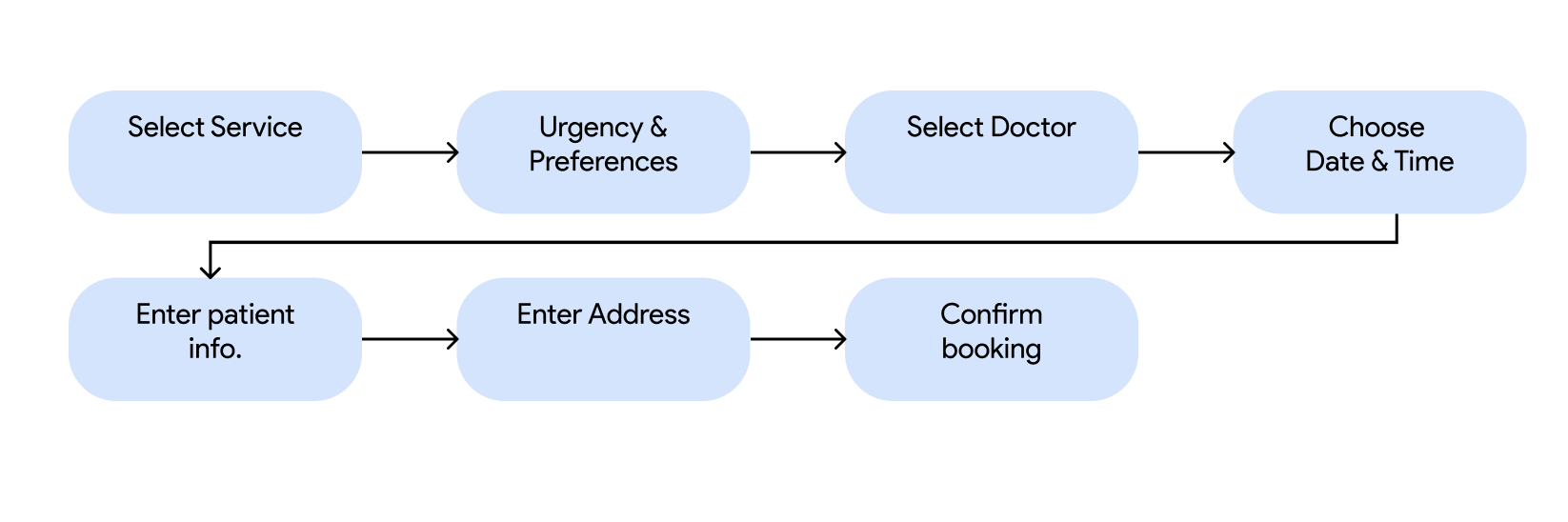
Due to the time constraints for this project, we chose to design a simple booking flow where the user can book a quick doctor’s visit and schedule them to come to her home. Keeping the persona, Gerri Gladstone, at the forefront of our design decisions, we developed the task flow shown below.


Using the task flow diagram, one of our designers began sketching ideas on paper. This process helped her identify the key elements that needed to be included on each screen.
She based her decisions on the user persona and the potential pain points she might experience.
Likely to have Low Vision
Large type sizes
Color contrast should be high enough
Use text or other ways to indicate active states
Difficulty Micro-controlling Hands
Allow large clickable CTAs
Limit text input fields
Likely to have Low Digital Literacy
Use text rather than iconography
Create intentional copy


Branding
When we moved into the high-fidelity phase, we wanted to make sure our product aligned with the Google brand. We pulled their color palette and typeface to incorporate into our mobile application.
Accessibility was the key player for our design solution and it was helpful to know that Google’s colors and font styles adhere to the WCAG 2.1 guidelines.
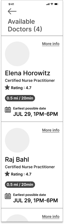
Final Prototype
While another designer and I worked on the slide deck presentation, our third UX designer began injecting color into the prototype, utilizing the brand guidelines.
We collaborated in Figma to finalize everything before stitching it together.
For this scenario, the persona, Gerri, wants to book an at-home doctor’s visit and opens Google HomeCare to make her appointment. She’s able to choose her preferences and select a doctor before inputting her details for the appointment.
Functionality > Aesthetics
There are several key features tailored to the accessibility needs that Gerri might have:
Large text and icons for impaired vision
Large CTAs to avoid mis-clicking on small fields
Voice input versus typing


Our web developers were able to code half of the task flow, so we would spend more time coding the rest of the prototype.
We would conduct more specific user interviews, user testing and gather data on what users would want out of this service.
Incorporate Google Assistant into the application to increase accessibility for all users.
