Project Overview
I designed Avani from May to July of 2022 during my UX Design bootcamp. We were tasked with choosing a problem space and designing a MVP over a 10-week time frame. Having a background in the retail industry, I chose to explore E-commerce and discovered that there was an area of opportunity: accurate sizing.
To solve this problem, I utilized an end-to-end UX Design approach where I focused on the target user and their needs. Through user interviews, usability testing and lots of design iteration, I created Avani, a retail brand that provides its users with a virtual tape measure. Users can take their measurements with the click of a button and say goodbye to those online returns!
My Role
Lead UX/UI Designer
User Research
UI Design
UX Writing
Usability Testing
Prototyping
Project Goal
Choose a problem space to explore and produce a digital solution during the 10 week time frame


I used a Human Centered Design approach to understand the target user group and design a solution that met their needs and motivations. Through comprehensive user research and analysis, multiple design iterations and usability test sessions, I was able to refine the product even further based on real user feedback.

Understanding the Problem
I conducted a literature review to understand the problem space further and uncover the pain points. According to statistics, millennials are the largest group of online shoppers in the U.S. and fashion is in the top 3 most popular categories to shop. In a recent study it was found that North American retailers lose about 183 billion dollars per year due to online returns. The #1 reason for returns? Wrong size.
An anthropometric study revealed that 97% of women didn’t know how to measure themselves correctly with a standard tape measure.
User Interviews
The next step was to interview the target user group and understand their needs, motivations and pain points. I facilitated three user interviews, each lasting roughly 30 minutes, where I asked 20 open ended questions. I gathered the interview results and used an affinity map to narrow down key themes and insights.

Interview Themes
Reviews
Millennial women value customer reviews because they like to see the product on real bodies.
Convenience
Millennial women value a convenient online shopping experience and return policy.
Unreliable Sizing
Millennial women don’t trust sizing guides. The result is them purchasing multiple sizes and returning the ones that don’t fit, a process they don’t enjoy.

User Persona
Next, I developed a user persona to support future design decisions. This persona is based on the key themes found through the affinity mapping process. The persona represents the target user group and will play an integral part during the design process. Designers and developers can refer back to the persona to make sure every decision aligns with her motivations and needs.

Experience Map
Once the persona was finalized, I mapped out her current online shopping experience through an Experience Map. The purpose of this map is to show the holistic experience people have when using a product. It captures their highs, lows and feelings along their journey to complete a task. It also tells us key moments where design intervention can be applied. .

User Stories
Using the persona of Camille Connor and the experience map, I created a list of user stories. These stories showcase a variety of tasks that Camille would like to complete when using this digital solution. I further categorized the stories into Epics (themes). I chose to focus on a single epic as I moved into the next phase.
Epics (Themes)
Viewing Options
Read Reviews
Convenience
Quality Assurance
Concept Sketches
The sketches on the right display my initial ideas for what the interface would look like. I utilized a UI Inspiration board, which I created on InVision, and pulled ideas from existing applications. The goal was to be unique while maintaining a sense of consistency with other products so that the user would feel self-reliant when moving through the flow.

Task Flow Diagram
After landing on this user story, I created a Task Flow Diagram as a visual means to map out the user’s journey with the proposed solution.
V1 Prototype
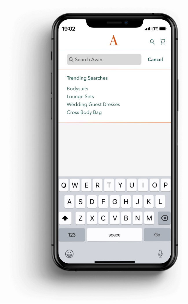
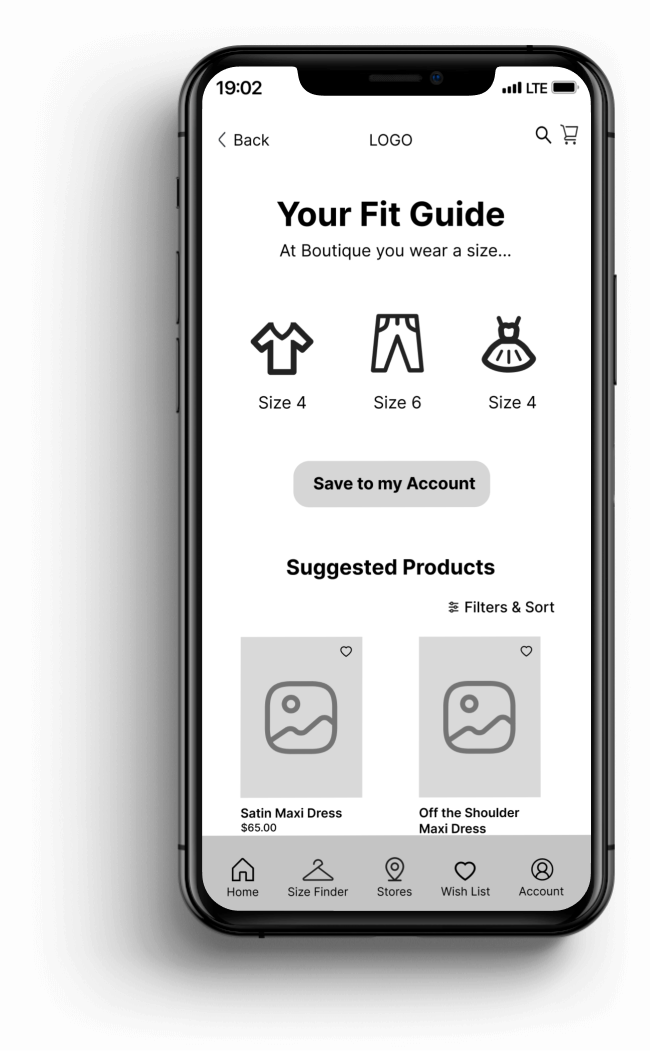
I transitioned my sketches into grayscale wireframes that were used for usability testing. The task flow focuses on the user recording a video of themselves and the camera scans their body to record their measurements. Using AR technology, the app captures their measurements and creates a custom size guide to assist them during their shopping experience. It includes their measurements, size recommendations and suggested products to browse. Sizes can be saved to their account for seamless shopping in the future and can be updated any time.

Usability Testing Feedback
Usability testing revealed a 5/5 success rate. I facilitated 5 test sessions with participants, 3 in person and 2 remotely. They were asked to complete 6 tasks while I asked them open-ended questions regarding the usability of the design. Color was not incorporated at this stage because my focus was on usability and I didn’t want the participants to get distracted with other elements. Three feedback themes emerged, shown below, and I used these findings to revise the design.
Context
Add more context to the second screen so the user has a better idea of what they will need to do before they get started with the video.
Participants were pretty unfamiliar with AR and wanted to have more clarity but wanted to be able to scan the content quickly.
I bolded the keywords to help guide the user’s eye and added graphics to visually display information.
Video Feedback
Add video feedback features on the screen while they are recording, so they can avoid error and know they’re doing it correctly.
Participants were vocal about wanting to know “in the moment” if they were accomplishing the task vs. receiving an error message after.
I ended up moving the instructions to a different screen in the final prototype.
Edit Content
Try to make heavy content more scannable through images or icons. Incorporate more description on Fit Guide screen as to WHY these products are suggested.
Participants wanted to see their measurements on the fit guide screen because it gave them a clear understanding of what the camera captured.
I changed the label “Suggested Products” to “Based on Your Shape, You May Like These Styles”, to address the WHY factor.
V2 Prototype
After one round of usability testing, synthesizing feedback and implementing revisions, I developed this final greyscale prototype. The main learning was that, with something as modern as AR, users need more context in a way that’s easy to quickly understand. Concise copy and visual displays of information were key.

Visual Design
To bring the product to life, I created a brand identity for the clothing store and pulled inspiration from the user interviews. Interviewees expressed that they wished more online retailers would incorporate diverse body types, less photoshop and focus on women’s natural beauty. This led to the creation of Avani. Avani is a Sanskrit word, meaning authenticity, generosity and earth mother.
Descriptive Adjectives for the Brand
Feminine, Calm, Inviting, Effortless, Real, Body Positive, Authentic, Natural, Earth Tones
Brand Moodboard

Colors
Pulled from moodboard
Light and inviting
Abide by accessibility standards
Earth toned and warm

Typography
Bodoni 72 for brand
Avenir Next for main text
Utilized a Serif and Sans Serif font pairing for contrast
Utilize various sizes and weights for information hierarchy

Final Screens

Avani was one of my first end-to-end projects as a UX Designer and there were so many takeaways. Not only did I gain experience in the technicality of designing a digital product but I learned how important it is to really listen to your users during test sessions and ask follow-up questions for further understanding. A lot of people will share their opinions about design work, which is also valuable, but I learned how to understand the difference between opinion and usability issues. I was also reminded of the value of design critiques from other designers because it pushed my work to reach its full potential.
User Story of Focus
As a millennial woman I want to view a size guide tailored to my body type so that I can understand my size at a particular store and feel confident purchasing product.
Tools
Figma
InVision
Zoom


71% of consumers say that online retailers don’t offer adequate sizing tools.


Before
After
Before
After
Before
After