Project Overview
At Signet Jewelers I had the opportunity to lead an innovation project, where I identified a problem space within our eCommerce ecosystem and presented my design recommendations to enhance the experience for our users while prioritizing high level business objectives.
Using data insights and previously conducted qualitative research, I chose to focus on enhancing the Favorites experience on eCommerce, with the goal to increase user engagement which was tied to longer session durations and higher likelihood for account creation and conversion.
I presented my case to the SVP of Experience Design and, with his sponsorship, led the research, design and presentation of findings/recommendations to senior executive leadership. My proposed designs were ultimately implemented across our nationally recognized brands, KAY, Jared and Zales.
My Role
Lead UX Researcher/Designer
Heuristic evaluation
Competitive research
Usability testing
UX/UI Design
Prototyping
Present concepts to SLT
Tools
Figma
Miro
Jira
UserTesting


Understanding the Problem Space
The first step in my design process is to explore the problem space in order to understand user needs and current industry standards. I searched our internal qualitative research repository and conducted desk research, utilizing The Baymard Institute, a reputable UX archive containing a wide range of User Experience studies that span across various digital experiences and industries.
Key Desk Research Findings:
2023 Google study revealed 60% of consumers take 6+ actions prior to deciding to buy a brand/product that’s new to them.
Baymard study of 2,214 internet shoppers found that Favorites plays an integral part in user shopping experience and deciding to purchase an item.
Implementation details that ensure effective usability include a favorites feature that’s easy to find/access saved items.
The Current Experience in Metrics
Favorites engagement was only 1-2% on average on Product Details Page and Product Listing Page (PDP & PLP)
Users that engage with Favorites were more likely to convert.
On average, users who add to Favorites will spend 26 minutes on the site, while those who don’t use the feature will only spend 5 minutes on the site (duration time).


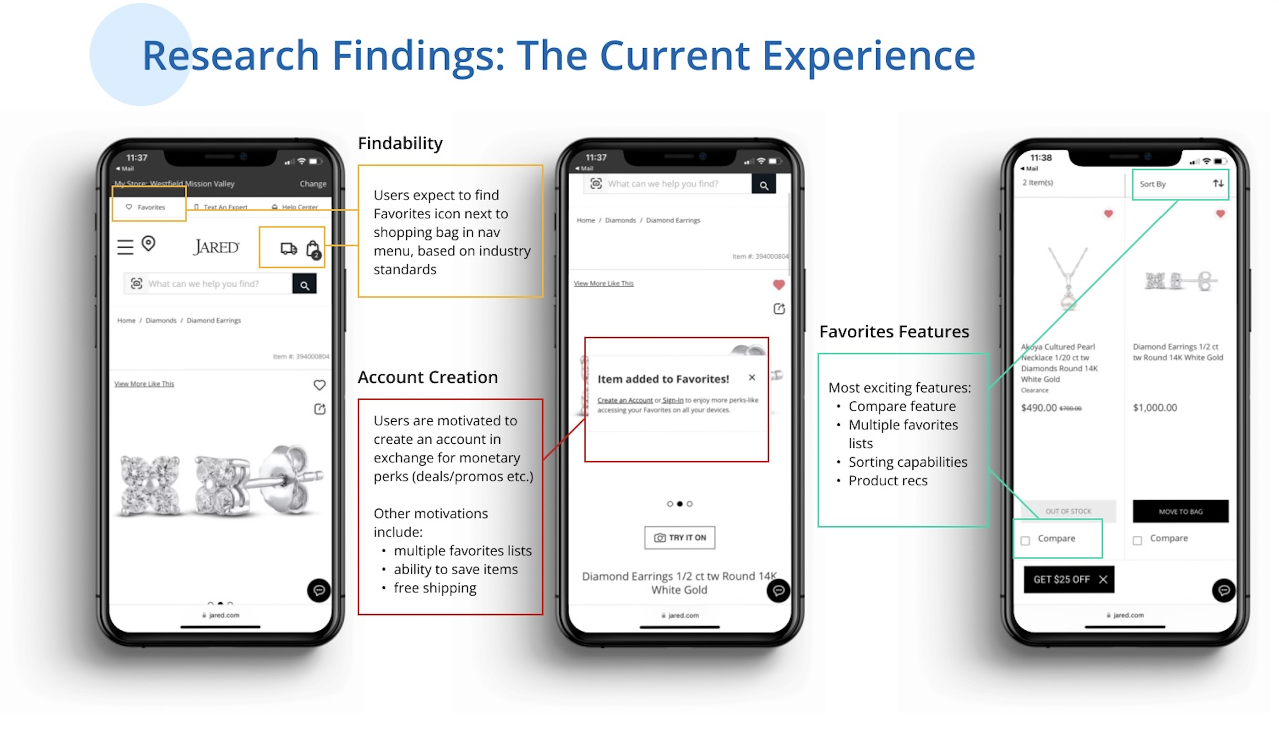
Evaluate the Current Experience
A heuristic evaluation is a method used for detecting usability issues with a given product. The 10 usability heuristics are a set of general principles used in interactive design to deliver optimal usability. Using these heuristics as a guide, I evaluated the current mobile experience of Favorites and discovered key points in the user journey that could be improved.
Findability: How can we improve the findability of the feature to meet user expectations and increase engagement?
Account Creation: How can we motivate unauthenticated users to create an account so that we can give them a more personalized experience while also increasing Signet’s ability to connect with them?
Exciting Features: Understand what features are most exciting/valuable on the favorites page and what users expect to see.


User Testing Round 1: Test the Current Experience
Next, I conducted the first round of user testing and brought users through the current Favorites experience. I tested our experience against one of our competitors, Tiffany’s, and used that as a benchmark to gather further insights.
Research Methodology:
Unmoderated user testing on Jared and Tiffany’s
Sample Questions Asked:
When shopping online, how do you use the Favorites feature?
When do you find this feature most valuable to use? Please explain in as much detail as possible.
How likely are you to create an account to access your favorited items?
Synthesis and Reporting Process
After observing the participant sessions on UserTesting, I compiled my notes and highlighted the key themes.
Additionally, I provided the screens tested and added my notes/key themes for a more visual report. This also makes it easier for other researchers/designers to understand the findings if they need to reference this work at a later time.


User Testing Round 2: Test New Design Concepts
Taking the user feedback and findings from the first round of testing, I created two new design concepts to test with our users. The goal with this round of testing was to validate the findings from previous research and refine the designs to meet user expectations. I had the users complete a series of tasks, beginning with favoriting an item and ending with account creation on the favorites page, gathering their thoughts/feedback along the way.
Research Methodology
Unmoderated user testing of two design concepts (comparative)
Key areas to focus on in testing:
Favorites Entry point
Interaction/Copy after user Favorites an item
Account Creation on Favorites Page
What features excite/delight? Multiple lists?

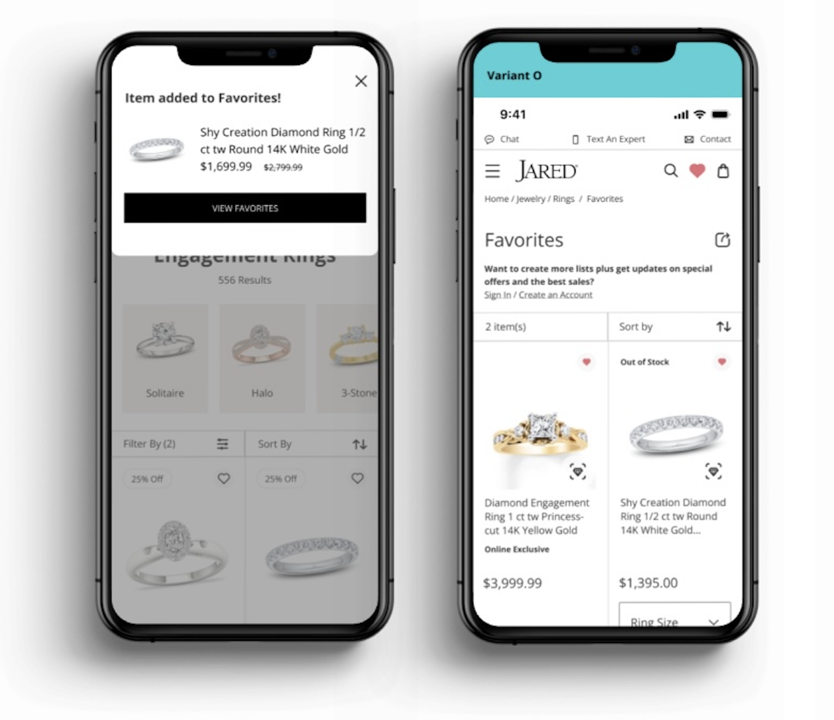
Variant O
For the first design concept, Variant O, I tested several key design features:
Added the Favorites icon in the global navigation menu.
Instead of a pop-up modal, I added a top sheet that slides down from the top to confirm the item was added to favorites. Wanted to test a new pattern that I observed on some of our competitor sites.
Included a “View Favorites” CTA in this top sheet (aiming to enhance findability and guide the user along their journey).
Kept the Sign in/Create an account link the same as the current state to test against a new design in the next variant.
Variant M
For the second design, Variant M, I tested these concepts:
Added the top sheet interaction after user favorites an item, using different copy/CTA’s which were tailored to account creation.
Added a “My Lists” entry point on the Favorites page, as this was a feature that excited users in the previous round of testing.
Moved the account creation prompt on the Favorites page to the bottom and included an email entry field instead of a single link.
I observed the second round of sessions on UserTesting, documented my notes and key themes and prepared to refine the designs to meet user expectations. I utilized Miro as my workspace where I created this note template and the specific screen callouts shown below.


Initial Design Concept Sketches

Results and Synthesis Findings


Design Recommendations

Final Designs
After compiling all my findings and iterations, I made the final design updates and presented a prototype of the proposed new experience to senior executive leadership. My Design recommendations that were moved into development and launched included:
Adding the Favorites icon into the global navigation menu
Updating the interaction/content in the modal, upon favoriting an item, to reflect the product details and a CTA to “View Favorites”
Updating the create account presentation and placement on the Favorites Page


How did we measure success?
After launching the updated Favorites experience on our mobile/desktop eCommerce sites, we saw:
21.13% increase in ATB (add-to-bag) conversion rates from the Favorites page
Improved visibility and accessibility to the feature on eComm
Increased browse experience satisfaction by 1.6pts QTR over QTR and 4% YOY