Project Overview
When I joined Signet Jewelers, there was no incentive for our loyalty members to invite their social circle to the Vault Rewards loyalty program. Our goal was to design an experience that enabled and incentivized customers to encourage their friends and family to join Vault Rewards on eComm and increase new enrollments.
I started by mapping out the user journey with a task flow diagram and presented the initial concepts to our product team before moving into the design phase. After conducting competitive analyses and making several design iterations, we launched the Refer a Friend experience on the KAY, Jared and Zales eComm sites.
My Role
Lead UX Designer
UX/UI Design
Competitive Research
Prototyping
Present concepts to stakeholders
Tools
Figma
Jira
Miro


Explore the Problem Space
After our product partners presented the business goals, problem statement and overall objectives for this project, I began conducting a competitor analysis to further understand the problem space. Additionally, I searched our research repository to see if we had any prior research findings archived that could inform my design decisions. See competitor analysis below, with some of my notes:


Map out the Experience / Task Flow Diagram
Next step was to map out what this experience would look like on the KAY website and present my recommendations to product/stakeholders. I iterated on this task flow diagram several times before sharing the final diagram (shown below).
Constraints / Things to Consider:
Users must be authenticated in order to refer friends/family
Recipient must create an account/opt in to T&Cs before they can get their referral discount
The referrer will be notified via email once their friend has created an account that their discount will unlock


Once our product partners and stakeholders were in alignment with our proposed task flow diagram, I started creating some sketches and initial design concepts. I collaborated with my creative director and copywriter to make several iterations before our first design review with product/stakeholders.
A few examples of my design approach:
Simplicity is at the core of good design
Guide the user with intentional and informative copy
Create clear entry points and provide visual confirmation for user actions
Entry Point - Modal

Concept Sketches / Initial Designs
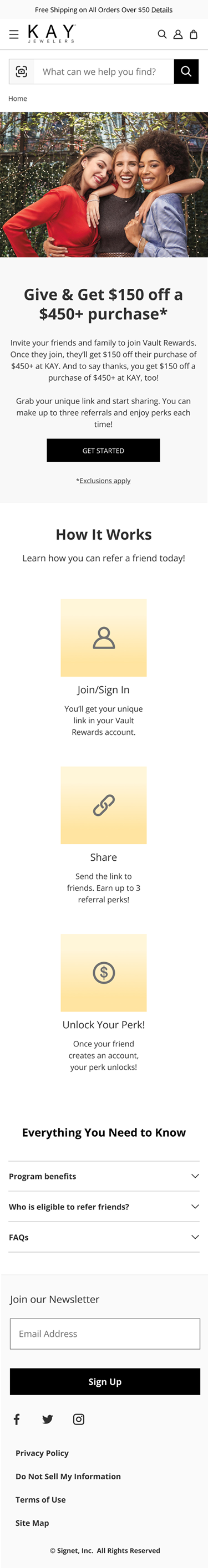
Marketing Landing Page

Account Dashboard Card

Share Drawer


Final Designs & Prototypes
After several design reviews with our product/tech partners and multiple iterations we launched the designs shown below.
View Prototypes here.
Key Updates made:
Updated the entry point from a pop-up modal to a link in the global navigation menu (due to multiple existing pop-ups on the website)
I added a variety of sign in error states for different user stories we needed to consider (see some examples below):
friend with existing loyalty account
friend enrolled in loyalty with one of our other brands
friend enrolled in loyalty in-store but not on eComm
After discussion with tech, I updated the share functionality to match the native share experience (for mobile and desktop designs)
Injected loyalty brand elements (color, iconography etc.) at several points along the user journey in order to promote loyalty brand identity throughout the experience
Included various states for the my account dashboard view of the promo cards:
Referral card - 0 referrals used
Referral card - with one active promo card visible
Referral card - with multiple active promo cards visible
An all referrals used banner message
Entry Point

Marketing Landing Page
Account Dashboard Card

Share Functionality


How will we measure success?
We launched the Refer a Friend promo experience on eComm with the goal of increasing loyalty membership enrollments and conversion rates. Success will be measured by these metrics and further iterations will be made based on user experience feedback/analytics.